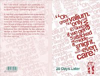
My final 3 outcomes for the screenplay for; Taxi Driver, 28 days later and the exorcist.
Monday 23 March 2009
Becks Beer Final Designs
Tuesday 24 February 2009
Becks Fusion website homepage
Becks beer Fusions Poster and double page spread
Here are some more ideas for the poster and a double page spread advert which could feature in a magazine about music for example, i have used the Becks Fusion lifeform as the background and placed over it an image of a Becks beer bottle and type. The sub heading reads: "In 2009 we are bringing leading muscians and atists together in a series of amazing one-off performances". I have also added a sound wave onto the image.
Tuesday 10 February 2009
Critical analysis Faber and Faber 10/02/2009
Using the website http://ilovetypography.com/ I have had many ideas for this brief, the website is very helpful and has many useful links, tutorials and examples of high-end type design.
As the books are not just of film scripts, the design I create must fit across a whole range of different genres and titles. As I have chosen to create five film covers I will have different age groups to be target, depending on the story line and the films age certificate, knowing this, i have to creatively use typography to attract a large age group range effectively.
For my initial ideas I have been experimenting with type and different typefaces, so far both ideas for my Becks project and for the Faber project have been very similar, as I have chosen to use type for both. I want to create a simple yet eye-catching design for the book covers, which as are all from the same series. They must be consistent and instantly recognizable to the consumer/reader. My final outcome for this brief will be a folder of research; initial ideas and development drawings; printed designs and the final cover art.
Critical analysis Becks Beer 10/2/2009
For the Becks beer brief, I have chosen to create packaging for a four-pack, six-pack and eighteen-bottle crate, an advertising campaign consisting of four posters and a mock up of the Becks Fusions homepage.
So far on this brief I have been experimenting with the use of type and how I can fit and interlink words together to create a background for the packaging or posters, or put the type within an image, for example selecting the outline of a beer bottle and using “paste into” in Photoshop to create an image of a beer bottle using type. Some of these initial ideas I have put on my online blog. After doing these initial ideas I have started to place the type onto images that will also reflect the music side, for example images of bands playing live in front of large audiences such as at Reading or Glastonbury. I want to use a lot of black within the image to stick with the Becks guidelines and also so the Becks Fusions logo can be incorporated correctly. I am also going to use the Becks Fusions life form from the YCN pack. The typeface used must be Avant Garde.
I am going to create the campaign following these alcohol-advertising guidelines:
1. ▪ It may not be aimed specifically at minors or, in particular, depict minors consuming these beverages;
2. It shall not link the consumption of alcohol to enhanced physical performance or to driving;
3. It shall not create the impression that the consumption of alcohol contributes towards social or sexual success;
4. It shall not claim that alcohol has therapeutic qualities or that it is a stimulant, a sedative or a means of resolving personal conflicts;
5. It shall not encourage immoderate consumption of alcohol or present abstinence or moderation in a negative light;
6. It shall not place emphasis on high alcoholic content as being a positive quality of the beverages.
After looking at net designs for the packaging for the Becks beer packaging, and looking in a book called Special Packaging where there is a separate chapter within the book for the packaging of bottles and tins, I have chosen which nets I want to use for the newly designed Becks packaging.
Thursday 5 February 2009
Becks beer type posters
Today i made some initial idea posters for the becks brief, i am happy with the outcome of them, now i just need to incorporate the music into the images. I plan on experimenting with a different image in the background and using different words for the type :D
Some of the images change colors when i upload them.... dont no why.............. =(
Tuesday 27 January 2009
Becks Beer Initial Poster Ideas
Monday 26 January 2009
Critical analysis
Critical Analysis
Becks Beer
For the Becks beer brief, I chose to create cardboard packaging for a four-pack, six-pack and eighteen-bottle crate and a small advertising campaign consisting of two posters. I will visually dramatize the unison of art and music within the lifestyle built around Becks Beer to challenge and inspire young people, using my own imagery and use of text.
For my comparative research I have looked at how other leading beer companies advertise and brand themselves. Using their packaging, labeling and website. Using a website called adsoftheworld I have looked at – Heineken, Absolut Vodka, Amstel, and Corona. I have compared them to Becks current branding and i have determine what changes could be made to target the desired audience more accurately.
As I will be trying to reach men and women between the ages of 18 and 34 with a progressive, optimistic outlook and whom value independent thought, the packaging and posters must be bright, eye catching, and original. I have been looking at many other beers packaging at their points of sale in supermarkets, to help me pin point which designs caught my attention and had more impact than others and why.
In my research on alcohol advertising I found rough guidelines which designers should follow when advertising an alcoholic beverage:
▪ It may not be aimed specifically at minors or, in particular, depict minors consuming these beverages;
▪ It shall not link the consumption of alcohol to enhanced physical performance or to driving;
▪ It shall not create the impression that the consumption of alcohol contributes towards social or sexual success;
▪ It shall not claim that alcohol has therapeutic qualities or that it is a stimulant, a sedative or a means of resolving personal conflicts;
▪ It shall not encourage immoderate consumption of alcohol or present abstinence or moderation in a negative light;
▪ It shall not place emphasis on high alcoholic content as being a positive quality of the beverages.
I have looked at net designs for the packaging of the beer, I looked at a book called Special Packaging where there was a separate chapter within the book for the packaging of bottles and tins, the book has helped me a lot.
Faber and Faber
I had chosen to do the ministry of sound brief, and had worked on the research for that project including gorilla advertising, record labels and London nightclubs, but after some thought have decided to do the Faber and Faber brief instead as i think it is better suited to me as a designer.
I have researched the books in the "Faber and Faber Reel" series, and have printed off the current covers of the films within the brief. For my initial ideas i plan on experimenting with type and different typefaces, i want to create a simple yet eye=catching design for the book covers, which as are all from the same series be consistent and instantly recognisable to the consumer/reader. My final outcome for this brief will be a folder of research, initial idea and development drawings, printed designs and the final cover art.
For my research i will go to Waterstones in Canterbury city center and look for other series of books and see how each cover relates to another to show another designers use of consistency, and how effectively they work. I will use the internet and college library to look at other book publishers, and find examples of existing film script publishes.
As the books are of film scripts, each film will have a different age group to be targeted, depending on the story line and the films age certificate, knowing this, i have to creatively use typography to attract a large age group range effectively. The books generally will be attracted to film enthusiasts, and therefore the cover artwork must be original, fun, cutting edge and exciting.
Wednesday 21 January 2009
Tuesday 20 January 2009
Advertising Ellis Brigham Proposal
On this project i will be working with Sian Bourn, we are going to research the brand Ellis Brigham to find out about the company history and to get examples of their existing advertising. We plan on creating a series of advertising pages, 3 single pages and double page spread, which will be placed into extreme sports magazines to promote ellis brigham.
Within the designs i plan on using photography. We will keep the Ellis Brigham logo on each page using the same colour schemes and typefacs to keep the adverts looking consistant. The outcome to this project will be a series of advertising pages two research file, and a sketch book.
Thursday 8 January 2009
Reading Lists
Becks Reading List
I plan on looking at the books in the reading list given within our briefs:
Author, Title,Publisher , ISBN
Agile Rabbit, Special Packaging Designs Pepin Press, 9057680548
Agile Rabbit , Special Packaging Designs Pepin Press, 9057680440
Cullen, CD 1000 Bags, tags and labels Rockport, 1592531830
Denison, E More Packaging Prototypes Rotovision, 2940361371
Editors of Rotovision The Designers Packaging Bible Rotovision, 294036172X
Herriott, L The Packaging Design Book Compiler, 2940361738
Klimchuk, M Packaging Design John Wiley & Sons, 047172016X
These books will help me learn more about packaging and hopefully give me some good ideas, I will also look at a book named ‘Packaging – Design successful packaging for specific customer groups’. This book examines how packaging is designed to appeal to specific groups based on gender, age, socio-economic group, disposable income, profession and shopping habits. It also explains how and why specific choices have been made and why they work, and how an idea has evolved from a prototype or concept to form successful, user-centred design.
Ministry of Sound Reading List
Author, Title, Publisher, ISBN
Atchison, J Cutting Edge Advertising, Prentice Hall, 9812445579
Berger, W Advertising Today, Phaidon, 0714843873
Burtenshaw, K Creative Advertising AVA Publishing, 2940373183
Himpe, T Advertising is Dead Thames & Hudson, 0500513147
Montague, T Guerrilla Advertising Laurence King, 1856694704
Monday 5 January 2009
Module 2: Corporate Imaging from the YCN Briefs
I am going to create exciting and innovative applications for the ministry of sound logo using Guerrilla advertising, to demonstrate that the logo itself can be applied to different environments and media spaces and attract people to the brand.
For my comparative research I plan on looking at other major music labels such as Sony Music Group, EMI and Universal Music Group, along with other major worldwide known brands which has used Guerrilla advertising such as NikeID Energiser and Adidas. I also plan on looking at creamfields.
Target Audience is aimed at young to middle-aged men and women from all backgrounds, who enjoy music and who actively watch live acts, participate in the club scene, and buy music.
Module 1: Becks Beer From the YCN Brief
I have chosen to create cardboard packaging for a four-pack, six-pack and eighteen-bottle crate and a small advertising campaign consisting of two posters, I will visually dramatise the unison of art and music within the lifestyle built around Becks Beer to challenge and inspire young people, using my own imagery and use of text.
For my comparative research I will look at how other leading beer companies advertise and brand themselves. Using their packaging, labeling and website, I will compare them to Becks current branding and determine what changes could be made to target the desired audience more accurately.
I will be trying to reach men and women between the ages of 18 and 34 with a progressive, optimistic outlook and whom value independent thought. Constant discovery and hunger for fresh social experiences drives this group, whether that’s at a club, gig, gallery or cinema.
Saturday 22 November 2008
Tuesday 14 October 2008
Hip Hop Album Cover Art Images
I have finally collected all my album cover images to go within the book, here is a slideshow of my chosen images, starting with the 70's and progressing through up until the present day, i have mainly gathered the images from the internet and a book named Hip Hop Album art which i used for my comparative research:
Monday 22 September 2008
Art Direction - Proposal Hip Hop Album Cover Art
Art Direction:
For my Art Direction Project i have decided to make my collection consist of Hip Hop album covers ranging from mid to late 70's to the present day, i plan on mapping the development of Hip Hop album artwork from its origins to the present day.
The book will include a full history of how and where Hip Hop was founded, and will include information about the founders and most influential people involved in making Hip Hop what it is today.
Structure of the Book:
I plan on setting the book into chapters. The book will start with a double page spread for the contents pages as their will be 200+ pages as i plan on featuring 100 artists. The first chapter will contain history and origins of hip hop including images of artists , turntables graffiti and break dancing. After this each chapter will be set into chronological order dating from the 70's until the present day.
Chapters and Headings:
Chapter 1: History of Hip Hop
Chapter 2: Rappers Delight
Chapter 3: Licensed to Ill
Chapter 4: Illmatic
Chapter 5: Me against the World
Chapter 6: The massacre
Each chapter heading is the name of one of the most popular and best selling album of that time period, i chose to do this so the reader can maybe remember and relate to the album covers within each chapter.
Format, size and binding:
My book will be 7" x 7", and perfect bound. I plan on getting the book professionaly bound by howard at Parker Printing in Wincheap.
Subscribe to:
Posts (Atom)